deliteful/Combobox
deliteful/Combobox is a form-aware and store-aware widget leveraging the
deliteful/list/List widget for
displaying the list of options.
Main features: * Allows to benefit from the customization mechanism of the list item rendering. * Provides single and multiple selection modes. * Provides optional interactive filtering of list of options (single selection mode only). * Multichannel rendering.
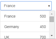
Example of deliteful/Combobox (single choice mode, on desktop browser):

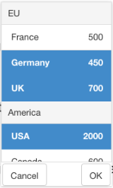
Example of deliteful/Combobox (multiple choice mode, on mobile browser):

Table of Contents
Element Instantiation
Using Combobox
Element Styling
Enterprise Use
Element Instantiation
For details on the instantiation lifecycle, see delite/Widget.
Declarative Instantiation
require(["delite/register", "deliteful/Store",
  "deliteful/Combobox", "requirejs-domready/domReady!"],
  function (register) {
    register.parse();
  });
<html>
  <d-combobox>
    <d-list store="store"></d-list>
  </d-combobox>
  <d-store id="store">
    { "label": "France", ... },
      ...
  </d-store>
</html>
Programmatic Instantiation
require(["delite/register", "dstore/Memory", "dstore/Trackable",
         "deliteful/Combobox", "deliteful/list/List",
         "requirejs-domready/domReady!"],
  function (register, Memory, Trackable, Combobox, List) {
    register.parse();
    // Create the store
    var dataStore = new (Memory.createSubclass(Trackable))({});
    // Add options
    dataStore.add(...);
    ...
    // Create the List
    var list = new List({store: dataStore, ...});
    // Create the Combobox
    var Combobox = new Combobox({list: list, selectionMode: "multiple"});
    Combobox.placeAt(document.body);
});
Note that the list property is set by default to a newly created instance of
deliteful/list/List. Hence, applications can write:
    var combobox = new Combobox();
    // Create the store
    combobox.list.store = ...;
    ...
Using Combobox
Selection
The widget provides two selection modes through the selectionMode property:
"single" (only one option can be selected at a time) and "multiple" (one or more
options can be selected).
Options can be selected programmatically using the selectedItem property (or, for multiple
selection mode, selectedItems) inherited from delite/Selection.
Auto Filtering
In single selection mode, if the property autoFilter is set to true (default is false)
the widget allows to type one or more characters which are used for filtering
the list of shown list items. By default, the filtering is case-insensitive, and an item
is shown if its label contains the entered string.
The default filtering policy can be customized using the filterMode and
ignoreCase properties.
The valid values of filterMode are:
"startsWith": the item matches if its label starts with the filter text."contains": the item matches if its label contains the filter text."is": the item matches if its label is the filter text.
The matching is case insensitive by default. Setting ignoreCase to false turns
it case sensitive.
The filtering is performed by the filter(fitlerTxt) method, which is called automatically
while the user types into the editable input element, with filterTxt being the currently
entered text. The default implementation of this method uses dstore/Filter.match().
The matching is performed against the list.labelAttr attribute of the data store items.
The method can be overridden for implementing other filtering strategies.
Attribute Mapping
The customization of the mapping of data store item attributes into render item attributes
can be done on the List instance using the mapping API of
deliteful/list/List, as supported by its superclass
delite/StoreMap.
See the delite/StoreMap documentation for
more information about the available mapping options, and the section
Store capabilities of List's documentation.
Multichannel rendering
The widget provides multichannel rendering: the popup is displayed on
large screens (desktop-like) below/above the main element, while on small and medium
screens (phone-like and tablet-like), to optimize the usage of the available space,
the popup is displayed in a centered overlay (an instance of deliteful/Combobox/ComboPopup
is used in this case).
The channel is controlled by the value of the has() channel flags set by
deliteful/features using CSS media queries depending on the screen size.
See the deliteful/features documentation
for information about how to configure the channel. Also, see the
deliteful/channelBreakpoints documentation for information
about how to customize the values of the screen size breakpoints used by the media queries.
Value and form support
The widget supports the following form-related properties: value, name, disabled
and alt, inherited from delite/FormWidget, and
readOnly inherited from delite/FormValueWidget.
When used in an HTML form, the submitted value is the one stored in the value
property of the widget.
By default, the label field of the List's render items is used as value of the option.
If the value needs to be different than the label, an attribute mapping needs to be
set for value on the List instance, for example:
  // Create the store
  var dataStoreWithValue = new Memory({idProperty: "label",
    data: [
        { label: "France", value: "FR" },
        { label: "Germany", value: "DE" },
        ...
    ]});
    // Create the List and set valueAttr to specify the name of the field
    // which stores the value of the item (valueFunc can also be used
    // for dynamically computed values)
    var list = new List({store: dataStoreWithValue, valueAttr: "value", ...});
    // Create the Combobox
    var combobox = new Combobox({list: list, ...});
    combobox.placeAt(document.body);
or in markup:
<html>
  <d-combobox>
    <d-list store="storeWithValue" valueAttr="value"></d-list>
  </d-combobox>
  <d-store id="storeWithValue">
    { "label": "France", "value": "FR" },
      ...
  </d-store>
</html>
If no mapping is specified for value, the label is used as value (itself subject to
attribute mapping using List.labelAttr or List.labelFunc).
In single selection mode, the widget value is the value of the selected option. In multiple selection mode, the widget value is an array containing the values of the selected options.
Element Styling
Supported themes
This widget provides default styling for the following delite theme:
- bootstrap
CSS Classes
CSS classes are bound to the structure of the widget declared in its template deliteful/Combobox/Combobox.html.
The following table lists the CSS classes that can be used to style the Combobox widget.
| Class name/selector | Applies to |
|---|---|
| d-combobox | Combobox widget root node. |
| d-combobox-input | The native <input> nodes used by the Combobox widget. |
| d-combobox-list | The List widget displayed inside the popup. |
| d-combo-ok-button | The OK button used in some cases inside the popup. |
| d-combo-cancel-button | The Cancel button used in some cases inside the popup. |
Enterprise Use
Accessibility
| type | status | comment |
|---|---|---|
| Keyboard | ok | For details, see below this table. |
| Visual Formatting | ok | Tested for high constrast and browser zoom (200%), in IE and Firefox. |
| Screen Reader | ok | Tested on JAWS 15 and iOS VoiceOver. |
Keyboard navigation details: * DOWN arrow opens the focused combobox. * In single selection mode: * UP and DOWN arrows select the next, respectively the previous option. * RETURN and ESCAPE validate the change. * In multiple selection mode: * UP and DOWN arrows navigate to the next, respectively the previous option. * SPACE toggles the selected state of the currently navigated option. * RETURN and ESCAPE validate the change.
Globalization
deliteful/Combobox provides an internationalizable bundle that contains the following
messages:
| Key | Role |
|---|---|
| "multiple-choice" | Text written in the combo in multiple selection mode if more than one item is selected. |
| "multiple-choice-no-selection" | Text written in the combo in multiple selection mode if no item is selected. |
| "search-placeholder" | Set as placeholder attribute of the input element used for filtering the list of options. |
| "ok-button-label" | The label of the OK button used for multiple selection mode on mobile. |
| "cancel-button-label" | The label of the Cancel button used for multiple selection mode on mobile. |
The first 3 strings in the table above are used as default values for the widget properties
multipleChoiceMsg, multipleChoiceNoSelectionMsg, and respectively searchPlaceHolder.
To customize these strings on a per-widget basis, set directly these properties.
Right to left orientation is supported by setting the dir attribute to rtl on the
widget.
Security
This class has no specific security concern.
Browser Support
This class supports all supported browsers.
