
deliteful/Select
deliteful/Select is a form-aware and store-aware widget leveraging the native
HTML5 select element.
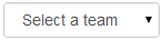
Example of deliteful/Select (single choice mode):
Example of deliteful/Select (multiple choice mode):
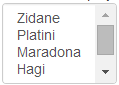
Table of Contents
Element Instantiation
Using Select
Element Styling
Enterprise Use
Element Instantiation
For details on the instantiation lifecycle, see delite/Widget.
Declarative Instantiation
require(["delite/register", "deliteful/Store", "deliteful/Select", "requirejs-domready/domReady!"],
  function (register) {
    register.parse();
});
<html>
  <d-store id="myStore">
    {"text": "Option 1", "value": "1"},
    ...
  </d-store>
  <d-select selectionMode="multiple" store="myStore"></d-select>
</html>
Programmatic Instantiation
require(["delite/register", "dstore/Memory", "dstore/Trackable",
         "deliteful/Select", "requirejs-domready/domReady!"],
  function (register, Memory, Trackable) {
    register.parse();
    var select = new Select({selectionMode: "multiple"});
    // Create the store
    var store = new (Memory.createSubclass(Trackable))({});
    select.store = store;
    // add options to the Select widget
    store.add({text: "Option 1", value: "1"});
    ...
    select.placeAt(document.body);
});
Using Select
Selection Mode
The widget provides several selection modes through the selectionMode property
inherited from delite/Selection.
For details, see Using delite/Selection.
Note that deliteful/Select only supports for this property the values single and
multiple.
Attribute Mapping
deliteful/Select uses the following attributes of data store items:
* The text attribute for the label of the option elements.
* The value attribute for their value attribute.
* The disabled attribute for the disabled state of the option (an option is enabled
if the attribute is absent, or its value is falsy, or it is the string "false").
Because the widget inherits from delite/StoreMap,
the mapping between the attributes of the data store items and the attributes used by
deliteful/Select can be redefined using the labelAttr, valueAttr, and disabledAttr
properties, or using labelFunc, valueFunc, and disabledFunc properties. See the
delite/StoreMap documentation for more
information about the available mapping options.
Element Styling
Supported themes
This widget provides default styling for the following delite theme:
- bootstrap
CSS Classes
CSS classes are bound to the structure of the widget declared in its template deliteful/Select/Select.html.
The following table lists the CSS classes that can be used to style the Select widget.
| class name/selector | applies to |
|---|---|
| d-select | Select widget node |
| d-select-inner | The inner native HTML <select> |
In addition, the following class is used in combination with the classes above:
| class name/selector | applies to |
|---|---|
| d-select-focus | Select widget in focus state |
Note that level of support for styling the inner native HTML <select> (and
particularly its <option> children) is browser-dependent.
Enterprise Use
Accessibility
| type | status | comment |
|---|---|---|
| Keyboard | ok | All supported desktop browsers provide keyboard accessibility for the native HTML5 select element. |
| Visual Formatting | ok | Tested for high constrast and browser zoom (200%), in IE and Firefox. |
| Screen Reader | ok | Relies on screen reader's ability to work with the native HTML5 select element. Tested on JAWS 15 and iOS 8 VoiceOver. With Chrome 35, it does not announce the selected option (although it correctly announces the option initially selected). No issue with VoiceOver. |
Globalization
deliteful/Select does not provide any internationalizable bundle. The only strings displayed
by the widget are coming from the user data through the store from which the options are retrieved.
Right to left orientation is supported by setting the dir attribute to rtl on the
widget.
Security
This class has no specific security concern.
Browser Support
This class supports all supported browsers.