
deliteful/Slider
The deliteful/Slider widget allows selecting one value or a pair of values, from a range delimited by a minimum and
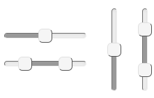
a maximum value. Slider can be oriented vertically or horizontally.
The selected value depends on the position of the handle and the step, which specifies the value granularity. The
position of the minimum and maximum depends on the text direction, and can be forced using the flip property.
Handles can be moved using pointers (mouse, touch) or keys (up, down, home or end).
A change event is fired after the user selects a new value, either by releasing a pointer, or by pressing a selection
key. Before a change event, input events are fired while the user moves the Slider handle.
The Slider Widget supports ARIA attributes aria-valuemin, aria-valuemax, aria-valuenow and aria-orientation.
Most of the Slider behavior (default values, out of bound values reconciliations...) is similar to the HTML5.1 input
type=range element, but it
doesn't strictly conform to the specification, in particular for:
- the multiple attribute (single/range Slider is directly determined from the content of the value property)
- the datalist attribute (see https://github.com/ibm-js/deliteful/issues/252)
Like the native input type=range element, this widget can be used in a form.
Table of Contents
Element Instantiation
Element Configuration
Element Styling
Mixins
Element Events
Enterprise Use
See also
Element Instantiation
See delite/Widget for full details on how instantiation lifecycle is working.
Declarative Instantiation
<html>
  <d-slider></d-slider>
  <d-slider value="12,32"></d-slider>
</html>
You can also specify the initial value in an input element:
<html>
  <d-slider>
    <input value="32">
  </d-slider>
  <d-slider>
    <input value="24,32">
  </d-slider>
</html>
That way you allow Slider to benefit from the browser capability to track the value when user select back/forward buttons.
Programmatic Instantiation
  require([
    "deliteful/Slider"
  ], function (Slider) {
    var slider = new Slider({value:10, step:5, min:10, max:50});
    slider.placeAt(document.body);
});
Element Configuration
Using value, min, max and step properties
min (default=0) and max (default=100) allow to set the minimum and maximum boundaries of the allowed range of
values.
step (default=1) specifies the value granularity. It causes the slider handle to snap/jump to the closest possible
value.
value, min, max and step properties must be valid floating-point numbers. Any other value is defaulted
according to the HTML 5.1 specification. value accept two values separated by a comma.
Selecting or sliding a range of values
When value contains two values separated by a comma, the Slider displays two handles. slideRange (default=true)
allow sliding the area between the handles to change both values at the same time.
When slideRange=false, pointing the area between the handles cause the closest handle to move at the pointer position
(Thus, changing only one value).
Slider direction and orientation
Default Slider orientation is horizontal. The vertical property (default=false) allow setting the vertical
orientation.
The Slider direction follows the language direction: with RTL languages the min is placed on the right. You may
force the orientation using the flip property (default=false).
Element Styling
Supported themes
This widget provides default styling for the following delite themes:
- bootstrap
CSS Classes
Style is defined by the CSS classes from the themes of the widget. CSS classes are bound to the
structure of the widget declared in its template deliteful/Slider/Slider.html
| class name | applies to |
|---|---|
| d-slider | the Slider widget node |
| d-slider-container | the container node, which represents the full length of slider progress bar. |
| d-slider-progress-bar | the progress bar node which represent the range between min and value or the range between |
| both values in the case of a range Slider | |
| d-slider-handle | slider handle(s) |
| d-slider-handle-max | the handle which represent the selected value (or the larger of the two values) |
| d-slider-handle-min | the handle which represent the smaller of the two values in the case of a range Slider |
There are other classes prefixed by d-slider, but they aren't meant to be overridden by the application.
Customizing the colors
Customizing the size
TODO + jsfiddle
The thick padding around the component helps the user interact with it on a touch screen.
For desktop, you might want to have a slimmer padding. You can change it thanks to the LESS variable
@d-slider-halo-size (or alternatively directly reduce the d-switch element padding).
User Interactions
The value of the Slider can be changed by:
- Using a pointer (touch, click...)
- moving a handle
- moving the bar between two handles when
slideRange=trueand value contains two values separated by a comma - pointing anywhere else on the Slider area: moves the handle that is the closest from the pointer position
- Using the
arrow left,arrow rightorarrow up,arrow downandhome,endkeys when the widget has the focus.
Mixins
No Mixin is currently provided for this widget.
Element Events
- Emits a
changeevent after that the value has been changed since that the slider has the focus, whenever the user releases its pointer or a presses a key from the keyboard. - Emits
inputevents when the value changes, whenever the user moves a handler.
Enterprise Use
Accessibility
The Slider supports WAI-ARIA role slider and ARIA attributes aria-valuemin, aria-valuemax, aria-valuenow and
aria-orientation on handle nodes.
| type | status | comment |
|---|---|---|
| Keyboard | ok | when handle has focus: arrow left, arrow right or arrow up, arrow down and home, end keys |
| Visual Formatting | ok | Support high contrast on Firefox and Internet Explorer desktop browsers. |
Browser Support
This widget supports all supported browsers without any degraded behavior.
See also
Samples
- deliteful/samples/Slider.html