
deliteful/ProgressBar
The deliteful/ProgressBar widget displays the completion progress of a task. The progress is either indeterminate,
indicating that progress is being made but that it is not clear how much more work remains to be done before the task
is complete, or the progress is a number in the range zero to a maximum, giving the fraction of work that has so far
been completed.
Overview of the Progress Bar by theme (bootstrap, iOS, Holodark)
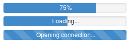
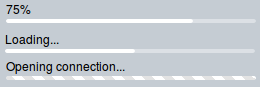
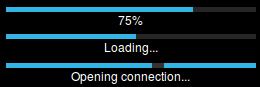
When the progress bar is determinate, a default message displays the percentage of progression. This message can be customized. ProgressBar theme style typically defines a looping animation to highlight its indeterminate state.
Table of Contents
Element Instantiation
Element Configuration
Element Styling
Element Events
Enterprise Use
See also
Element Instantiation
See delite/Widget for full details on how instantiation lifecycle is working.
Declarative Instantiation
<html>
  <d-progress-bar message="Please wait..."></d-progress-bar>
</html>
<html>
  <d-progress-bar value=0 max=100></d-progress-bar>
</html>
Programmatic Instantiation
  require([
    "deliteful/ProgressBar"
  ], function (ProgressBar) {
     var pb = new ProgressBar({max:100, value: 0});
     pb.placeAt(document.body);
     pb.value = 20;
});
Element Configuration
There are two properties that determine the current task completion represented by the element:
- the
valueproperty specifies how much of the task has been completed, - the
maxproperty specifies how much work the task requires in total.
The units are arbitrary and not specified. When Value isn't NaN, it always varies from 0 to max.
Determinate vs indeterminate
By default, deliteful/ProgressBar is indeterminate in a sense it doesn't indicate the level of completion of the
ongoing task.
Set a value comprised between 0 and the
maxproperty to make the progress bar determinate. A value greater thanmaxis converted to themaxvalue. An invalid or negative value is converted to 0.Set
value = NaNto make the progress bar indeterminate.
Default message
The default behavior of ProgressBar is to displays the percentage of completion when the state is determinate, and to display no message when state is indeterminate.
The property fractionDigits allows to specify the number of fraction digits to display.
Static custom message
Set the message property with a non-empty string to use a custom message.
Dynamic custom message
You can override the method formatMessage() to generate a dynamic custom message.
Additional message
Depending on the theme, an additional message may be displayed. For themes that display both messages, typically message is on one side and the additional message is on the other side.
You can override the method formatExtMsg() to customize this additional message. It will be visible only on
supported themes.
Element Styling
Supported themes
This widget provides default styling for the following delite themes:
- bootstrap
- ios
- holodark
CSS Classes
Style is defined by the CSS classes from the themes of the widget. CSS classes are bound to the
structure of the widget declared in its template deliteful/ProgressBar/ProgressBar.html
| class name | applies to |
|---|---|
| d-progress-bar | ProgressBar widget node |
| d-progress-bar-background | background node |
| d-progress-bar-msg | message node |
| d-progress-bar-msg-invert | inverted message node |
| d-progress-bar-indicator | indicator node |
| d-progress-bar-a11y | dedicated node used to show the indicator in contrast mode on supported browsers |
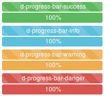
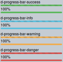
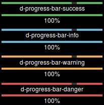
Customizing the colors
ProgressBar provides a set of CSS classes with predefined colors:
Customizing the size
Default widget size is 100% of its container. You may use the width standard CSS properties to specify the width.
.d-progress-bar {
  width: 200px;
}
Due to the nature of ProgressBar and to ensure consistent rendering under the provided themes,
we recommend that you rely on font-size CSS property to change the progress bar height.
Element Events
This widget does not emit any custom event.
Enterprise Use
Accessibility
| type | status | comment |
|---|---|---|
| Keyboard | N/A | No user interaction |
| Visual Formatting | ok | Support high contrast on Firefox and Internet Explorer desktop browsers. |
| Screen Reader | yes | Supports ARIA role progressbar. Tested with JAWS and VoiceOver |
Browser Support
This widget supports all supported browsers without any degraded behavior.
See also
Samples
- deliteful/samples/ProgressBar-basic.html
- deliteful/samples/ProgressBar-handler.html
- deliteful/samples/ProgressBar-messages.html