
deliteful/Button
The deliteful/Button widget is a push button that can display a label and / or an icon. It extends the HTML 5 button element.
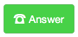
Table of Contents
Element Instantiation
Element Configuration
Element Styling
User Interactions
Mixins
Element Events
Enterprise Use
Element Instantiation
See delite/Widget for full details on how instantiation lifecycle is working.
Declarative Instantiation
<html>
  <button is="d-button">I am a Button!</button>
</html>
Programmatic Instantiation
  require([
    "deliteful/Button"
  ], function (Button) {
     var b = new Button({label: "I am a Button"});
     b.placeAt(document.body);
});
Element Configuration
The following properties can be set on the widget to configure it:
label: the label to display in the button;iconClass: DOM class to apply to a DOM node before the label in order to render an icon;showLabel: set it to true so that the button only displays an icon (especially useful for buttons in toolbars).
The disabled attribute is also supported, in order to disable the button. A disabled button appears as disabled and does not emit any event when clicked.
Element Styling
Supported themes
This widget provides default styling for the following delite themes:
- bootstrap
- ios
- holodark
Widget CSS Classes
The following CSS classes are automatically set by the widget and can be reused for overriding the default style.
| CSS Class | Description |
|---|---|
d-button |
The base class for a button |
Styling CSS classes
The following CSS classes provided by the widget can be set explicitly on the element yourself.
| CSS Class | Description |
|---|---|
d-button-success |
Indicates a successful or positive action |
d-button-info |
Indicates a neutral informative change or action |
d-button-warning |
Indicates a warning that might need attention |
d-button-danger |
Indicates a dangerous or potentially negative action |
Example of a custom button:
User Interactions
The only user interaction with a button is to activate it by:
- clicking it using a mouse;
- tapping it on a touch screen;
- pressing the SPACE key when the button has keyboard focus.
Mixins
No mixin currently available for this widget.
Element Events
This widget does not emit any custom event.
Enterprise Use
Accessibility
The widget has the same accessibility than a standard HTML 5 <button> element.
Globalization
This widget does not provide any internationalizable bundle. The only string displayed by the button is the one defined by its label property.
This widget supports both left to right and right to left orientation.
Security
This widget has no specific security concern.
Browser Support
This widget supports all supported browsers without any degrated behavior.