
deliteful/ToggleButton
The deliteful/ToggleButton widget represents a form-aware 2-state (pressed or unpressed) button with optional icons
and labels for each state. It is a subclass of the deliteful/Button class.
Example
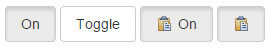
Table of Contents
Element Instantiation
Element Configuration
Element Styling
Element Events
Enterprise Use
See also
Element Instantiation
See delite/Widget for full details on how instantiation lifecycle is working.
Declarative Instantiation
<html>
  <button is="d-toggle-button">Wifi</button>
  <button is="d-toggle-button" checked>Wifi</button>
  <button is="d-toggle-button" checkedLabel="Enabled">Enable</button>
  <button is="d-toggle-button" checkedLabel="Bookmarked" iconClass="icon-star-empty" checkedIconClass="icon-star-full">Bookmark</button>
</html>
Programmatic Instantiation
  require([
    "delite/register",
    "deliteful/ToggleButton"
  ], function (register, ToggleButton) {
     register.parse();

     var tb = new ToggleButton({
         checked: true,
         checkedLabel: "On",
         checkedIconClass: "iconButtonPressed",
         label: "Off"
     });
     tb.placeAt(document.body);

     tb = new ToggleButton({checked: true, label: "WiFi"});
     tb.placeAt(document.body);
});
Element Configuration
The state of a ToggleButton widget (checked or unchecked) is defined by the checked property, inherited from the
deliteful/Toggle class.
By default, the label of the button is specified in markup as a child of the button element, or via the label
property, inherited from the deliteful/Button class. In addition to this label, an optional label can be defined for
the checked state via the checkedLabel property.
An optional icon can be specified via the iconClass property which takes a css class, inherited from the
deliteful/Button class. In addition to this icon, an optional icon can be defined for the checked state via the
checkedIconClass property.
Element Styling
Supported themes
This widget provides default styling for the following delite themes:
- bootstrap
Widget CSS Classes
The following CSS classes are automatically set by the widget and can be reused for overriding the default style.
They are bound to the structure of the widget declared in its template deliteful/ToggleButton/ToggleButton.html.
| CSS Class | Description |
|---|---|
d-toggle-button |
The base class for a toggle button |
d-checked |
Checkbox and checkmark nodes in checked state |
Styling CSS classes
The following CSS classes provided by the widget can be set explicitly on the element yourself.
| CSS Class | Description |
|---|---|
d-button-success |
Indicates a successful or positive action |
d-button-info |
Indicates a neutral informative change or action |
d-button-warning |
Indicates a warning that might need attention |
d-button-danger |
Indicates a dangerous or potentially negative action |
Element Events
The widget deliteful/ToggleButton provides a change event when its state is changed following a user interaction.
| event name | dispatched | cancelable | bubbles | properties |
|---|---|---|---|---|
| change | on state change | No | Yes | standard HTML5 Event properties |
Enterprise Use
Accessibility
| type | status | comment |
|---|---|---|
| Keyboard | yes | checked property is toggled when the space bar or the enter key are pressed. |
| Visual Formatting | ok | Support high contrast on Firefox and Internet Explorer desktop browsers. |
| Screen Reader | yes | Tested with JAWS and VoiceOver |
Browser Support
This widget supports all supported browsers without any degraded behavior.
See also
Samples
- deliteful/samples/Buttons.html