
deliteful/Switch
The deliteful/Switch widget represents a toggle switch with a sliding knob. Its state can be changed either by a
direct tap/click or by sliding the knob to toggle the switch.
Example of Switch widgets with and without labels
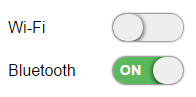
Table of Contents
Element Instantiation
Element Configuration
Element Styling
Element Events
Enterprise Use
See also
Element Instantiation
See delite/Widget for full details on how instantiation lifecycle is working.
Declarative Instantiation
<html>
  <body>
    <d-switch checked="true"></d-switch>
    <d-switch checkedLabel="ON" uncheckedLabel="OFF" name="bluetooth"></d-switch>
  </body>
</html>
Programmatic Instantiation
  require([
    "delite/register",
    "deliteful/Switch"
  ], function (register, Switch) {
     register.parse();

     var sw = new Switch({checked:true});
     sw.placeAt(document.body);

     sw = new Switch({checkedLabel: "ON", uncheckedLabel: "OFF", name: "bluetooth"});
     sw.placeAt(document.body);
});
Element Configuration
The state of a Switch widget (checked or unchecked) is defined by the checked property, inherited from the
deliteful/Toggle class.
The Switch widget can display optional labels corresponding to the checked and unchecked states via the checkedLabel
and uncheckedLabel properties.
In addition, the Switch widget supports the following form-related properties of an HTML5 input element of
type "checkbox": name, value, disabled and alt, inherited from delite/FormWidget.
Element Styling
Supported themes
This widget provides default styling for the following delite themes:
- bootstrap
- ios
- holodark
CSS Classes
CSS classes are bound to the structure of the widget declared in its template deliteful/Switch/Switch.html.
The following table lists all the CSS classes that can be used to style the widget.
| class name/selector | applies to |
|---|---|
| d-switch | Switch widget node |
| d-switch-width | Switch widget node |
| d-switch-rounded | Switch widget and knob nodes |
| d-switch-leading | Switch leading node (aka the node displayed in checked state). |
| d-switch-trailing | Switch trailing node (aka the node displayed in unchecked state). |
In addition, the following classes are used in combination with the classes above:
| class name/selector | applies to |
|---|---|
| d-checked | Switch widget node in checked state |
| d-focused | Switch widget node in focus state |
| d-rtl | Switch node in right-to-left configuration |
Customizing the appearance of the Switch
The rendering style used to display the checked and unchecked sides of a switch are defined by the d-switch-leading and
d-switch-trailing css classes.
The rounded border used to display both the switch main shape and the knob shape is defined by the d-switch-rounded
class.
The width of a switch is defined by the d-switch-width class and is equal to 70px by default.
Note that due to the way the switch was designed, you can't express its width in '%'. Any other unit will work.
A Switch widget does not define any specific height by default but strech according to the current line-height.
The following example shows how to override these classes to change the appearance of the switch:
Element Events
The widget deliteful/Switch emits a change event when its checked state is changed following a user interaction.
| event name | dispatched | cancelable | bubbles | properties |
|---|---|---|---|---|
| change | on state change | No | Yes | standard HTML5 Event properties |
Enterprise Use
Accessibility
| type | status | comment |
|---|---|---|
| Keyboard | yes | Value is toggled when the space bar is pressed. |
| Visual Formatting | ok | Support high contrast on Firefox and Internet Explorer desktop browsers. |
| Screen Reader | yes | Supports ARIA role checkbox. Tested with JAWS and VoiceOver |
Globalization
deliteful/Switch does not provide any internationalizable bundle. The only strings displayed
by the widget are coming from the checkedLabel and uncheckedLabel properties that are empty by default.
Browser Support
This widget supports all supported browsers without any degraded behavior.
Security
This class has no specific security concern.
See also
Samples
- deliteful/samples/Buttons.html