deliteful/RadioButton
The deliteful/RadioButton widget represents a 2-state widget similar to the HMTL5 input type="radio" element.
Contrary to other checkbox widgets like deliteful/Checkbox or deliteful/Switch, a RadioButton is usually used with
other RadioButton widgets to form a group of exclusive options. Only one RadioButton can be checked at a time within a
group.
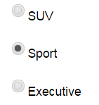
Example of RadioButton widgets

Table of Contents
Element Instantiation
Element Configuration
Element Styling
Element Events
Enterprise Use
See also
Element Instantiation
See delite/Widget for full details on how instantiation lifecycle is working.
Declarative Instantiation
<html>
  <body>
    <d-radio-button checked="true" name="category" value="SUV"></d-radio-button>
    <d-radio-button name="category" value="Sport"></d-radio-button>
    <d-radio-button name="category" value="Executive"></d-radio-button>
  </body>
</html>
Check the following jsfiddle example:
Programmatic Instantiation
  require([
    "delite/register",
    "deliteful/RadioButton"
  ], function (register, RadioButton) {
     register.parse();

     var sw = new RadioButton({checked:true, name: "category", value: "SUV"});
     sw.placeAt(document.body);
     sw = new RadioButton({name: "category", value: "Sport"});
     sw.placeAt(document.body);
     sw = new RadioButton({name: "category", value: "Executive"});
     sw.placeAt(document.body);
});
Element Configuration
A RadioButton widget is used in relation with other RadioButton widgets to form a group of exclusive choices. A radio
button group is defined as a logical group of RadioButton widgets that share the same name attribute value. When a
form is submitted, only the value of the checked RadioButton is submitted.
The state of a RadioButton widget (checked or unchecked) is defined by the checked property, inherited from the
deliteful/Toggle class. There can be only one RadioButton checked within a radio button group.
In addition, the Switch widget supports the following form-related properties of an HTML5 input element of
type "checkbox": name, value, disabled and alt, inherited from delite/FormWidget.
Element Styling
Supported themes
This widget provides default styling for the following delite themes:
- bootstrap
CSS Classes
CSS classes are bound to the structure of the widget declared in its template deliteful/RadioButton/RadioButton.html.
The following table lists all the CSS classes that can be used to style the widget.
| class name/selector | applies to |
|---|---|
| d-radio-button | RadioButton widget node |
| d-radio-button::before | RadioButton "reticule" |
In addition, the following classes are used in combination with the classes above:
| class name/selector | applies to |
|---|---|
| d-checked | RadioButton widget node in checked state |
| d-focused | RadioButton widget node in focus state |
Element Events
The widget deliteful/RadioButton emits a change event when its checked state is changed following a user interaction.
| event name | dispatched | cancelable | bubbles | properties |
|---|---|---|---|---|
| change | on state change | No | Yes | standard HTML5 Event properties |
Enterprise Use
Accessibility
| type | status | comment |
|---|---|---|
| Keyboard | N/A | No user interaction |
| Visual Formatting | ok | Support high contrast on Firefox and Internet Explorer desktop browsers. |
| Screen Reader | yes | Supports ARIA role radio. Tested with JAWS and VoiceOver |
Globalization
deliteful/RadioButton does not provide any internationalizable bundle.
Browser Support
This widget supports all supported browsers without any degraded behavior.
Security
This class has no specific security concern.
See also
Samples
- deliteful/samples/Buttons.html
