
deliteful/ViewIndicator
deliteful/ViewIndicator is a companion widget to deliteful/ViewStack (or its subclass deliteful/SwapView) that
shows which child of the ViewStack is currently visible. It displays a set of small dots corresponding to the
children of the ViewStack. The dot representing the visible child is white while the other dots are gray.
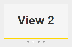
Table of Contents
Element Instantiation
Element Configuration
Element Styling
User Interactions
Enterprise Use
Element Instantiation
When creating a ViewIndicator, you must specify which ViewStack it is associated with using the viewStack property.
See delite/Widget for full details on how instantiation lifecycle is working.
Declarative Instantiation
require(["deliteful/SwapView", "deliteful/ViewIndicator", "requirejs-domready/domReady!"],
  function () {}
);
<html>
  <d-swap-view id="sv" style="width:100%; height:200px">
    <div style="background-color: darkblue">Child 1 (Default visible child)</div>
    <div style="background-color: white">Child 2</div>
    <div style="background-color: crimson">Child 3</div>
  </d-swap-view>
  <d-view-indicator viewstack="sv" style="width:100%"></d-view-indicator>
</html>
Programmatic Instantiation
require(["deliteful/SwapView", "deliteful/ViewIndicator", "requirejs-domready/domReady!"],
function (SwapView, ViewIndicator) {
  var sv = new SwapView({style: "width:100%; height: 200px"});
  var child1 = document.createElement("div");
  var child2 = document.createElement("div");
  var child3 = document.createElement("div");
  sv.addChild(child1);
  sv.addChild(child2);
  sv.addChild(child3);
  sv.placeAt(document.body);
  var vi = new ViewIndicator({viewStack: sv, style: "width:100%"});
  vi.placeAt(document.body);
});
Element Configuration
Properties
The viewStack property must be set to a deliteful/ViewStack or deliteful/SwapView id or instance.
The ViewIndicator will track visibility changes of the children of the specified ViewStack and update
its display
accordingly.
Element Styling
Supported themes
This widget provides default styling for the following delite themes:
- bootstrap
- ios
- holodark
CSS Classes
The dots can be customized using the following CSS classes:
-d-view-indicator-dotis added to all dots,-d-view-indicator-dot-selectedis added to the dot representing the visible child.
For example, the following rules would give a square shape to the dots and make the selected dot red:
css
.d-view-indicator .-d-view-indicator-dot {
    -moz-border-radius: 0;
    border-radius: 0;
}
.d-view-indicator .-d-view-indicator-dot-selected {
    background-color: red;
}
User Interactions
Clicking or touching a dot shows the corresponding child in the ViewStack. If the ViewIndicator is large enough (which depends on how it is laid out in the HTML page), clicking in the empty area on the right of the dots shows the next child in the ViewStack, and clicking on the left of the dots shows the previous child.
Enterprise Use
Accessibility
ViewIndicator does not provide accessibility support, as the ViewStack is already accessible through the Page Up / Down keys.
Globalization
deliteful/ViewIndicator does not provide any internationalizable bundle.
Right to left orientation is supported by setting the dir attribute to rtl on the deliteful/ViewIndicator element.
This affects clicks outside of the dots: in right-to-left mode, clicking in the empty area on the right of the dots
shows the previous child in the ViewStack, and clicking on the left of the dots shows the next child.
Security
This widget has no specific security concern. Refer to delite/Widget for general security advice on this base class that deliteful/ViewIndicator is using.
Browser Support
This widget supports all supported browsers.